
Bauer Inks.
Bauer Inks.

In 2018, my mother became a Canadian fountain pen ink distributor of Robert Oster Inks, and KWZ Inks.
The marketing revolved around paintings done by a teenaged me, and was popular in the GTA fountain pen community. However, after some time the company was not given the attention needed, and went silent.
At the end of October, 2025, I decided to take ownership of the company and give it a rebrand.
Here is my documentation of the rebranding.
Note: Things are still up for redesigning. Nothing is set in stone right now.

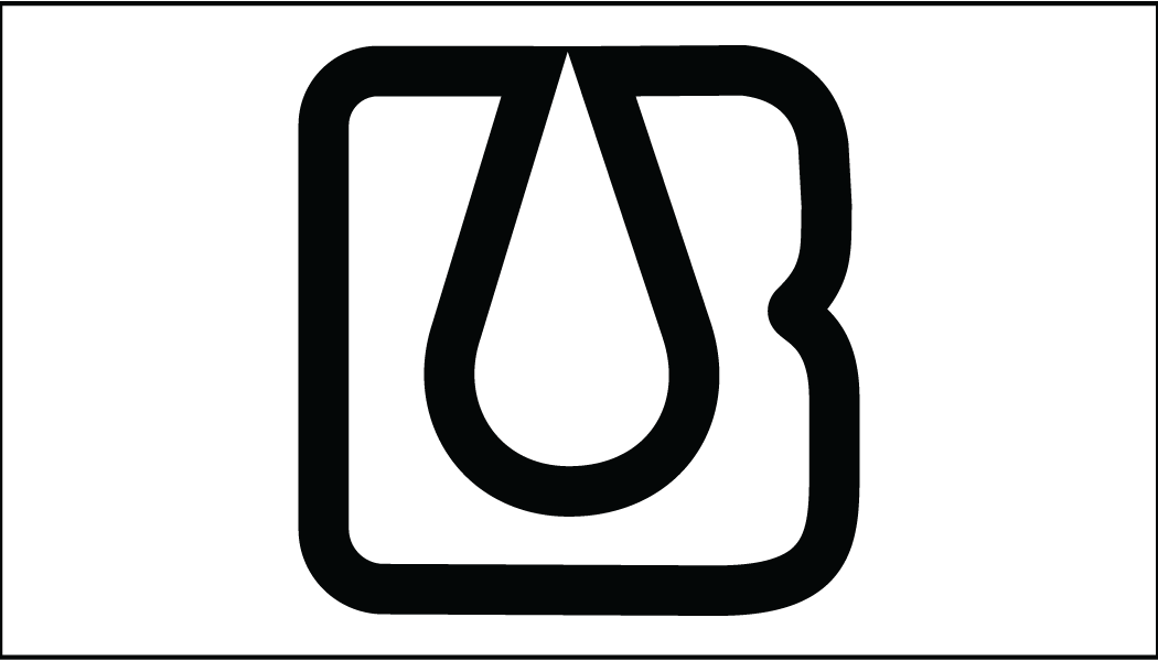
“The first thing you do when you start a band is talk about your influences. That’s how you figure out what kind of band you want to be” -Dewey Finn, School of Rock 2003
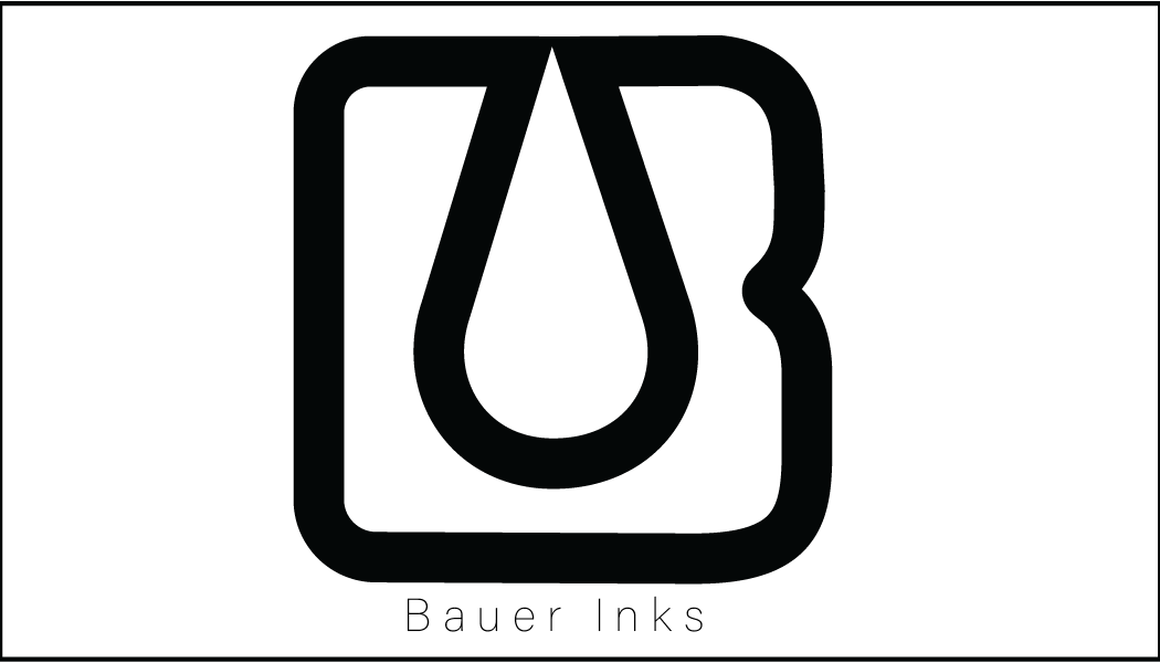
I have this same logic with art. I wanted sleek and sophisticated, and since we are distributing inks, I want ALL COLOUR TO BE ON THE INKS. And for me, getting the logo is the first step in knowing how you want the brand to look.
Here are some of the first sketches that led to the possible final design.
I always have the biggest headaches, but also the MOST fun with this.
“Make tiny thumbnails and make a ton of them. When they are smaller, you spend more time coming up with ideas. Details come later.” -Thom Sevalrud, Sheridan College 2018 or something

After making the logo, I started a new journey in figuring out SHOPIFY!
I am still setting up the online shop and the design. This will take longer to set up my dream shop, however I plan to at least get some items ready for sale by December.
As of right now however, the site looks really sleek!
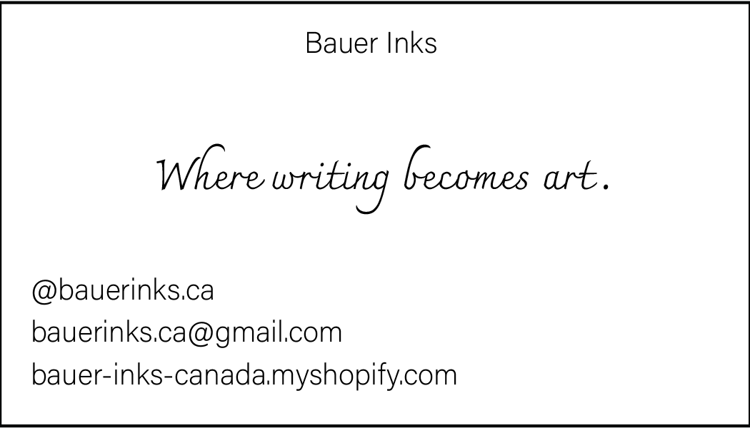
Next step, business card.

This may be a huge no-no, but I want the business card to have an ink design it in, and not be the exact logo used for the company. I think if the shape is there, this is an ok way to break the rule of marketing. Nike does it, so why can’t I?
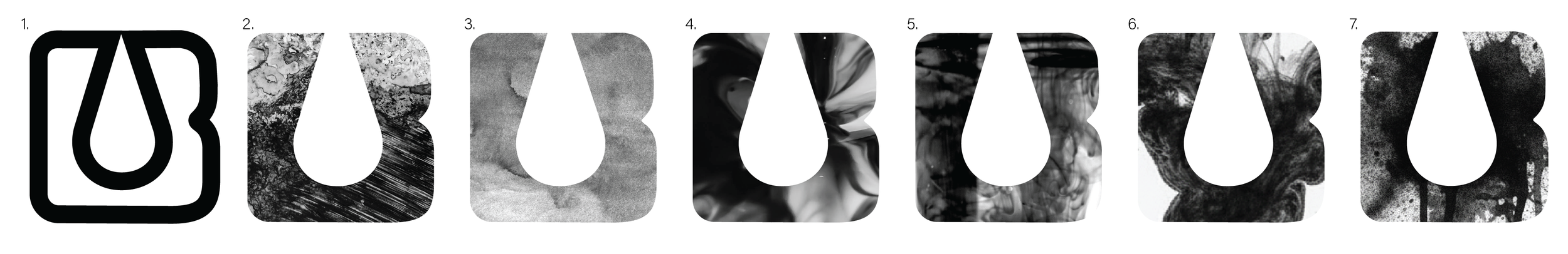
Rows of B’s - Playfulness with analog ink spills and ink spill images. I first consulted with my mom, and she was incredibly supportive and emotional looking at #7 as this was the first attempt, and thought it was perfect. After consulting with my husband, who is not familiar with fountain pen inks (he only writes with blue ink ball point pens) said that the first iteration of the card #7 looks like a printer error. To prove him wrong, I asked both fountain pen ink enthusiasts and non-enthusiasts to prove it is obviously an ink spill, to which I got “Looks like mold”, “bacteria”, and “fungus”. So I kept designing.
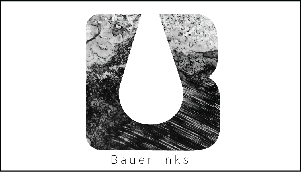
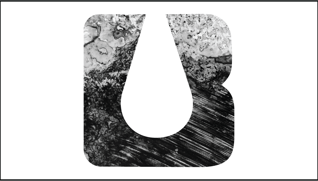
The intent with the business card is to also be used as a swatch card, in which case the original #1 would be ideal, however with the contrast of black, I believe adding more black will help give dimension to any ink swatches.
This will be tested with sample prints. Always do sample prints before full production.
The back of the card will be the boring information. I want the front to be pretty.
Anyway, I worked from #6, to #5, to #4, to #3, and finally to #2 which is my favourite, not for the logo but for the business card.
My husband still thinks simpler is best, and I agree, but I like the Japanese Manga feel it gives, with traditional India Ink and fine tip nib look, so he can just turn around and ssh.

Front


Back
At 11:11pm on November 12th, 2025:
I only want the textured card versus the simple line version of the front, but I will request samples of these cards, both versions, and test ink swatches on them.
Whichever looks the best as an ink swatch will reign supreme.
Also, “Where writing becomes art.” is the slogan now.
November 15th, 2025:
Played some more. Like it better with title below, however I still think the title isn’t needed at all. Opinions are welcomed.
If no title on the front, thinking to do it simpler with title in the back.
Note: “Where writing becomes art” I plan to have written with proper calligraphy OR my mother’s writing. Most likely black, but I would be able to play with the colour afterwards.
I’ll invite her over soon.
Further documentation incoming.
Further documentation incoming.
Please hold. I have a fulltime job, tattooing, doing improv, studying musical improv, a husband to cuddle, and I need to finish Succession.